Natjun
Brand / Print / Packaging
Food
2023
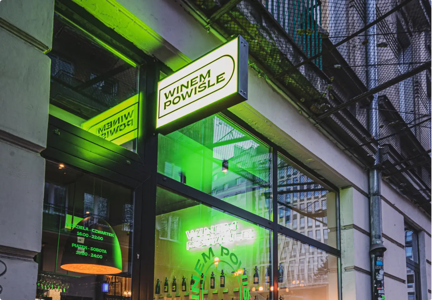
Józef - the owner
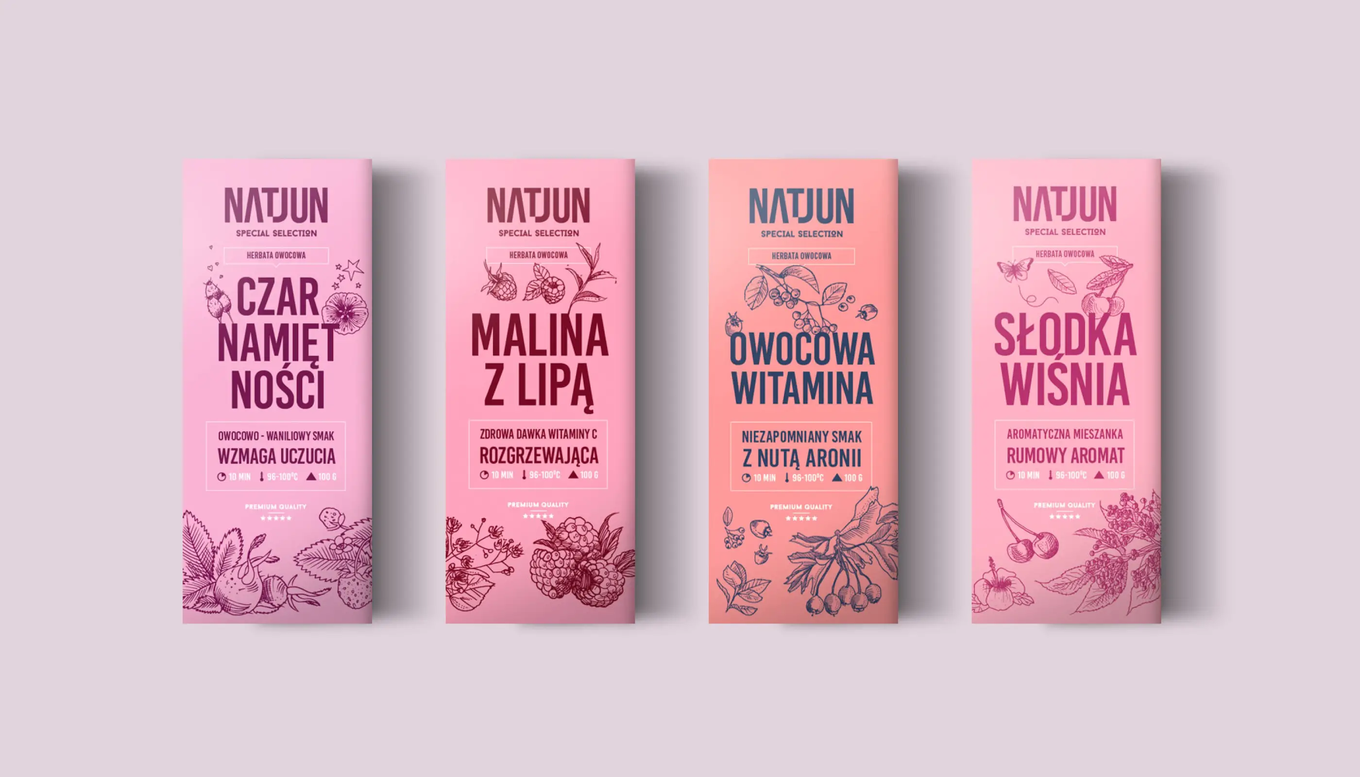
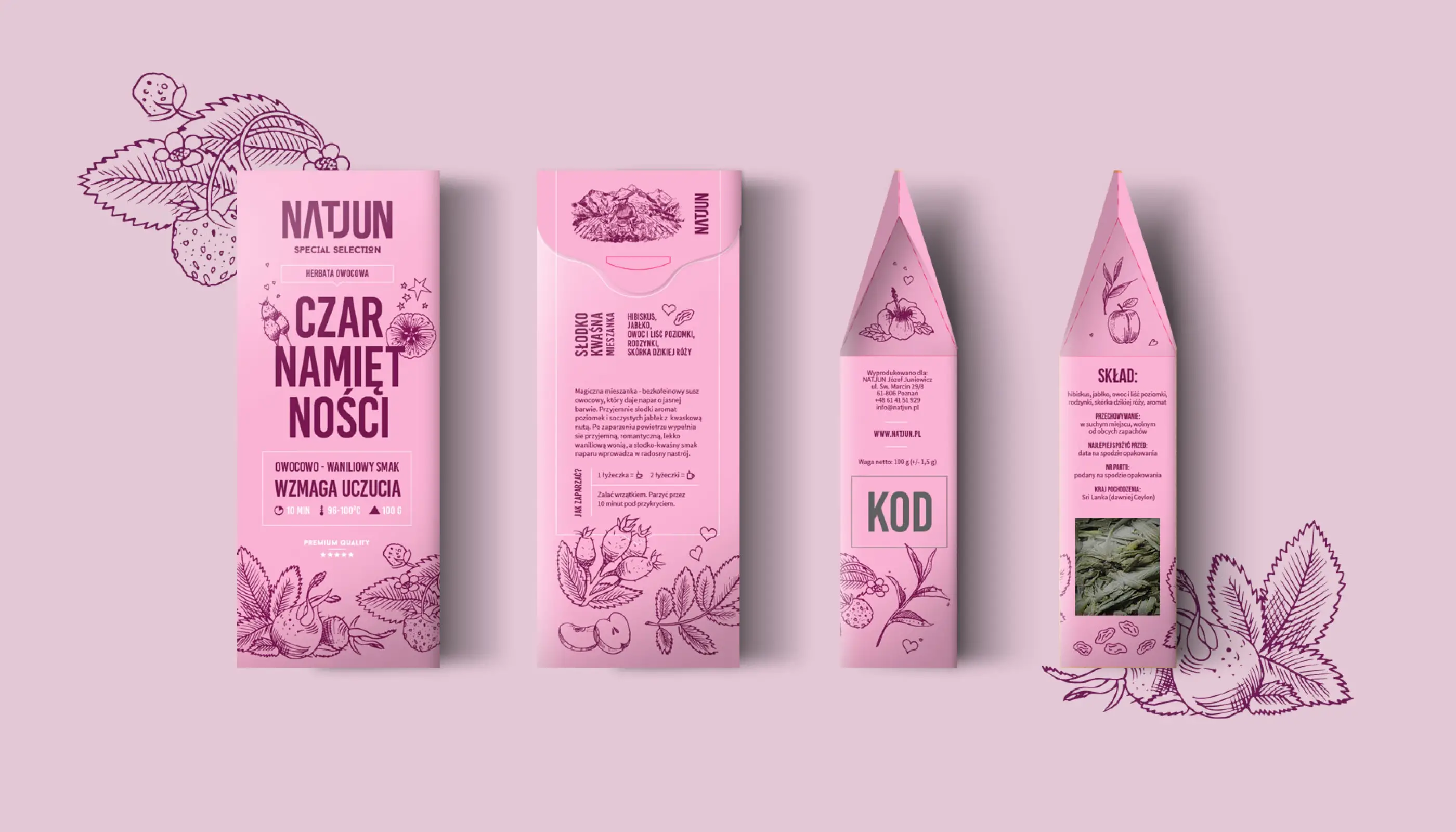
He entrusted me with the packaging design for dozens of his products over the years. Our collaboration started with his idea for his tea packaging — dark and dull designs. I convinced him to go for something entirely different: vibrant, neon colors that would breathe life into the brand.
A journey of evolution
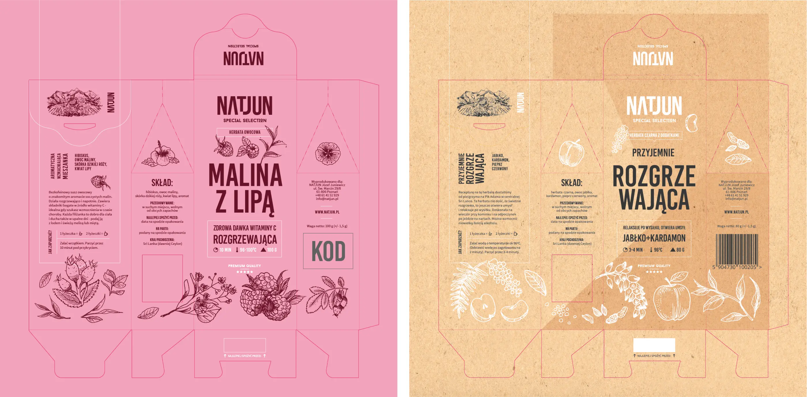
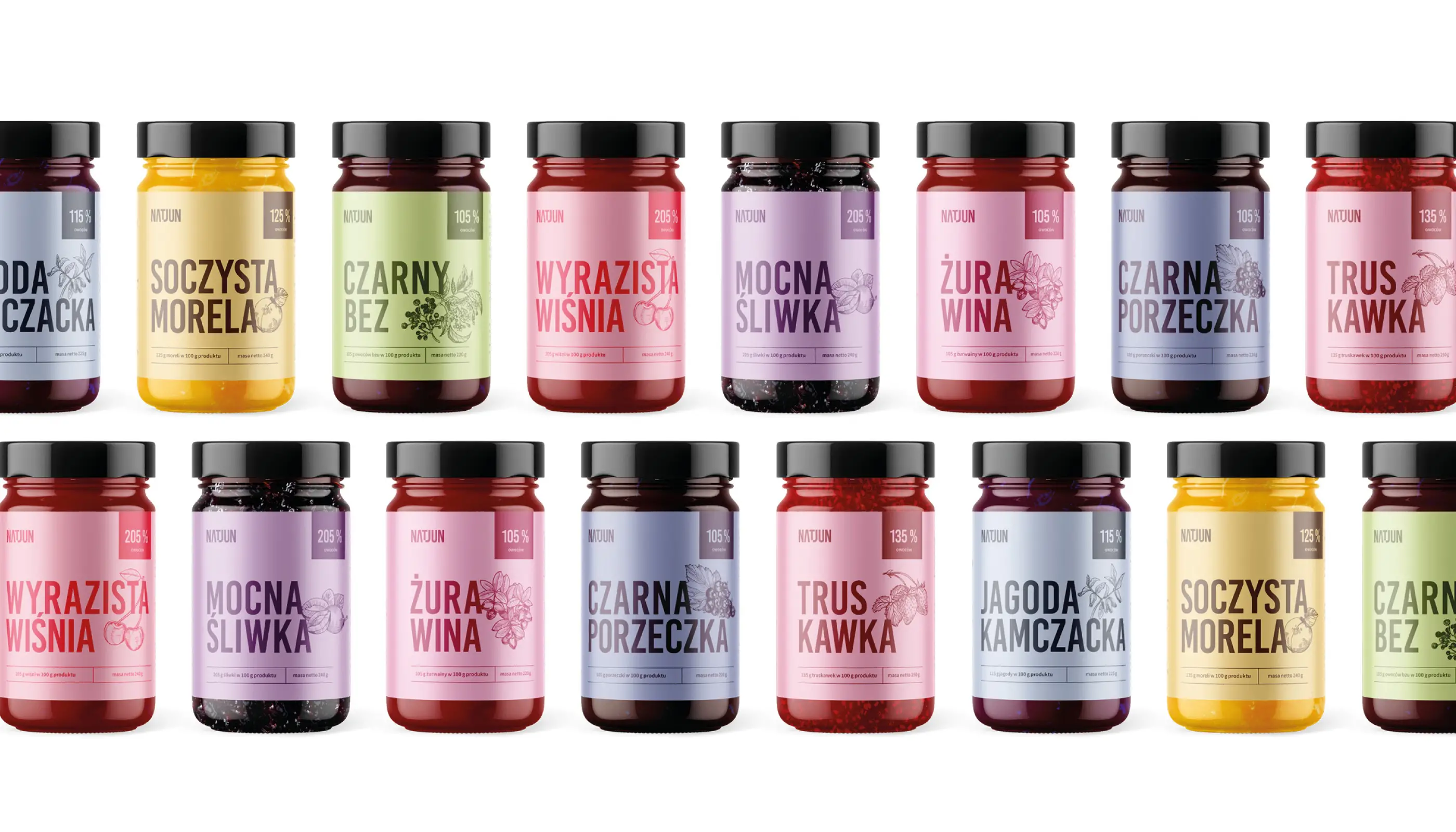
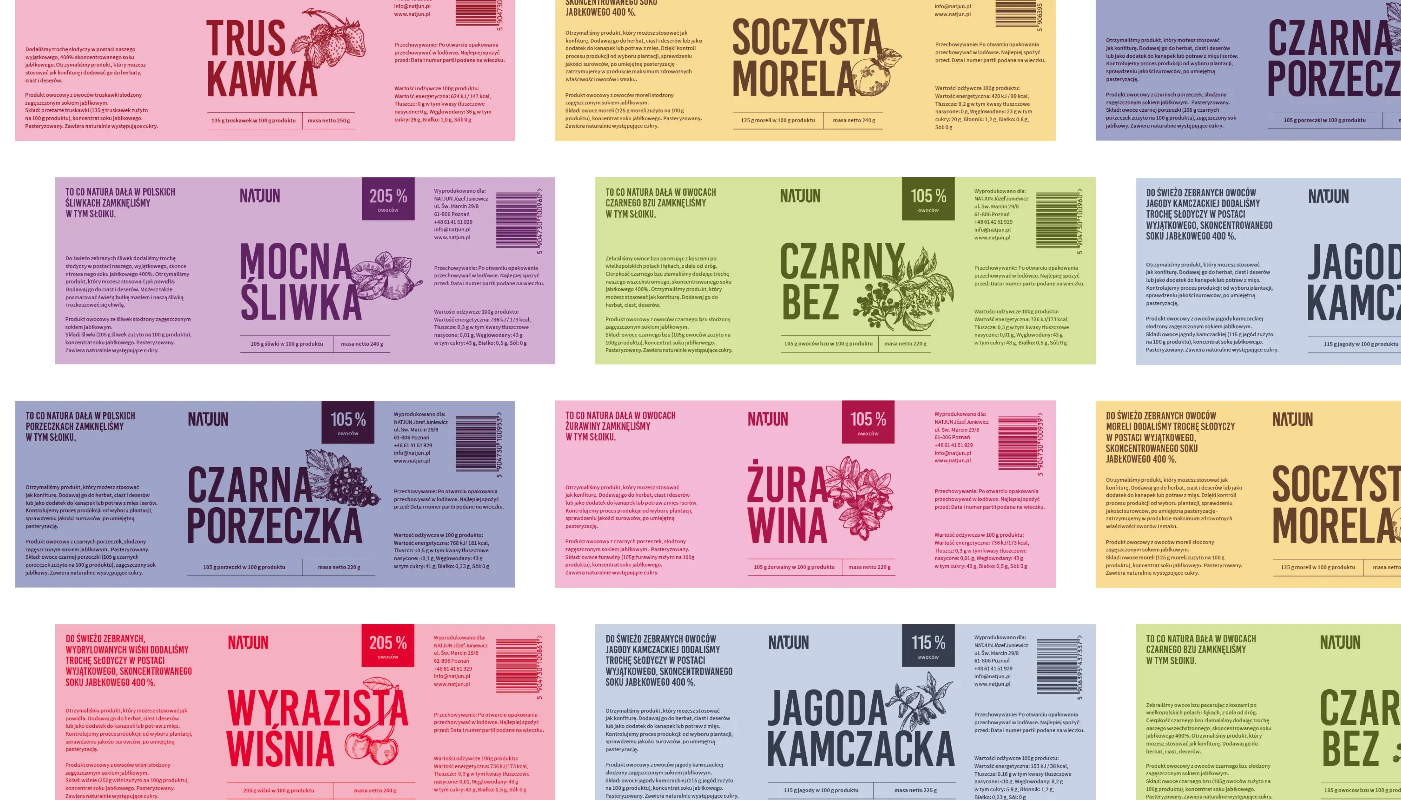
Over the years, the big challenge was to standardize the brand across all products and packaging. In the early stages, the packaging designs were richer and more detailed. As the brand evolved, we gradually simplified the design, stripping away anything unnecessary. Over time, the packaging reached a more minimalistic aesthetic. This transition allowed the packaging to be more focused and modern while staying true to the vibrant character of the brand.
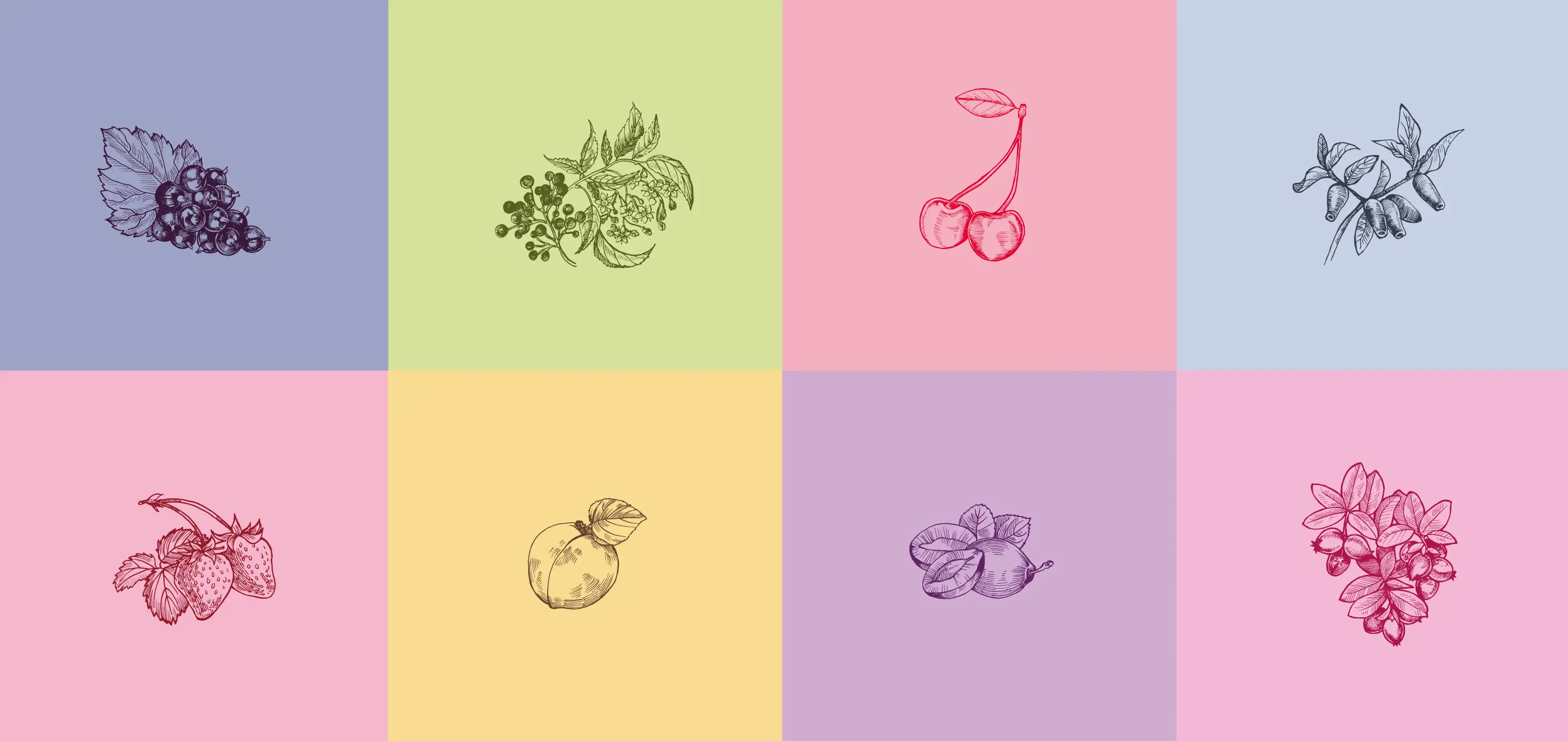
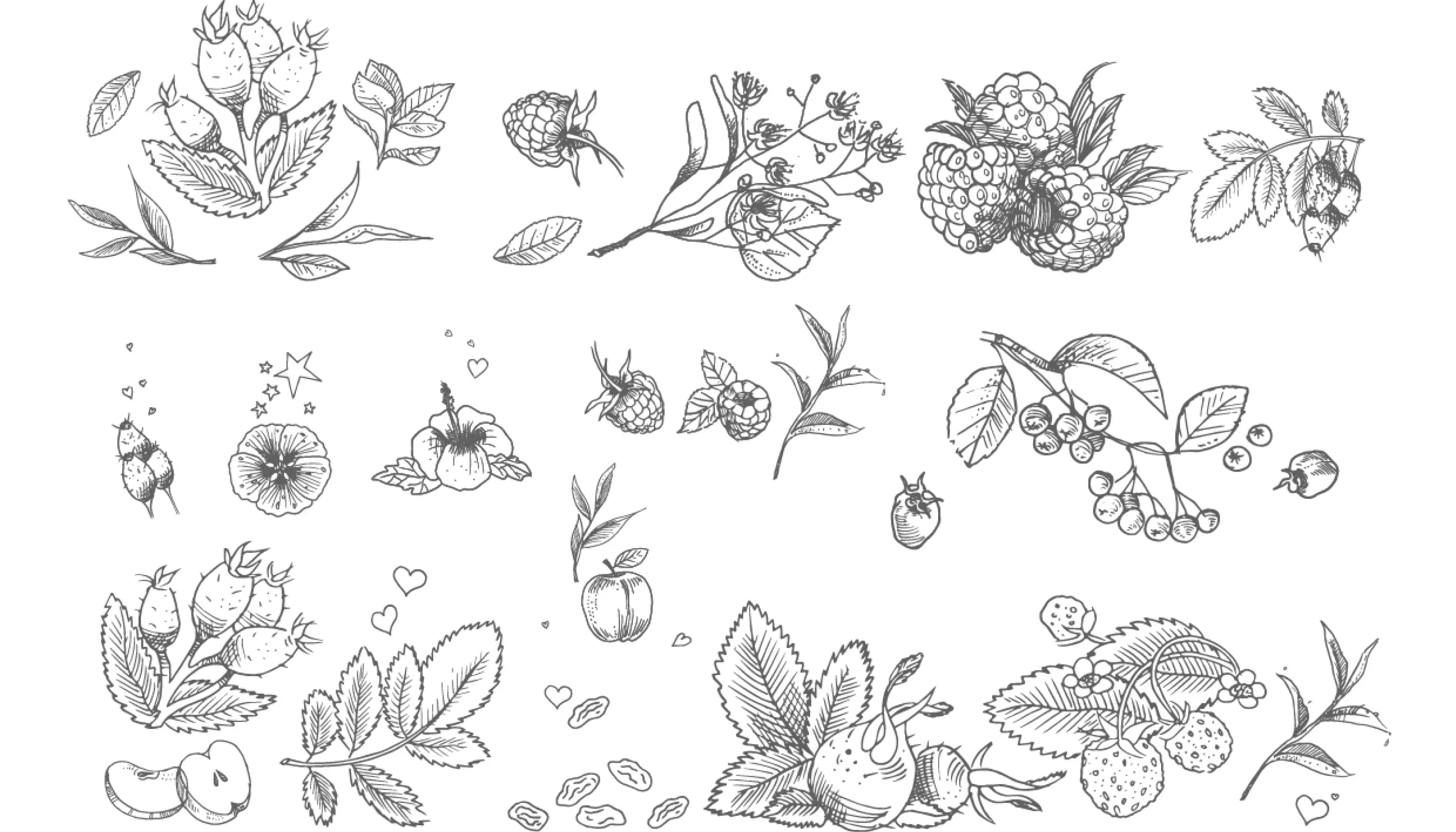
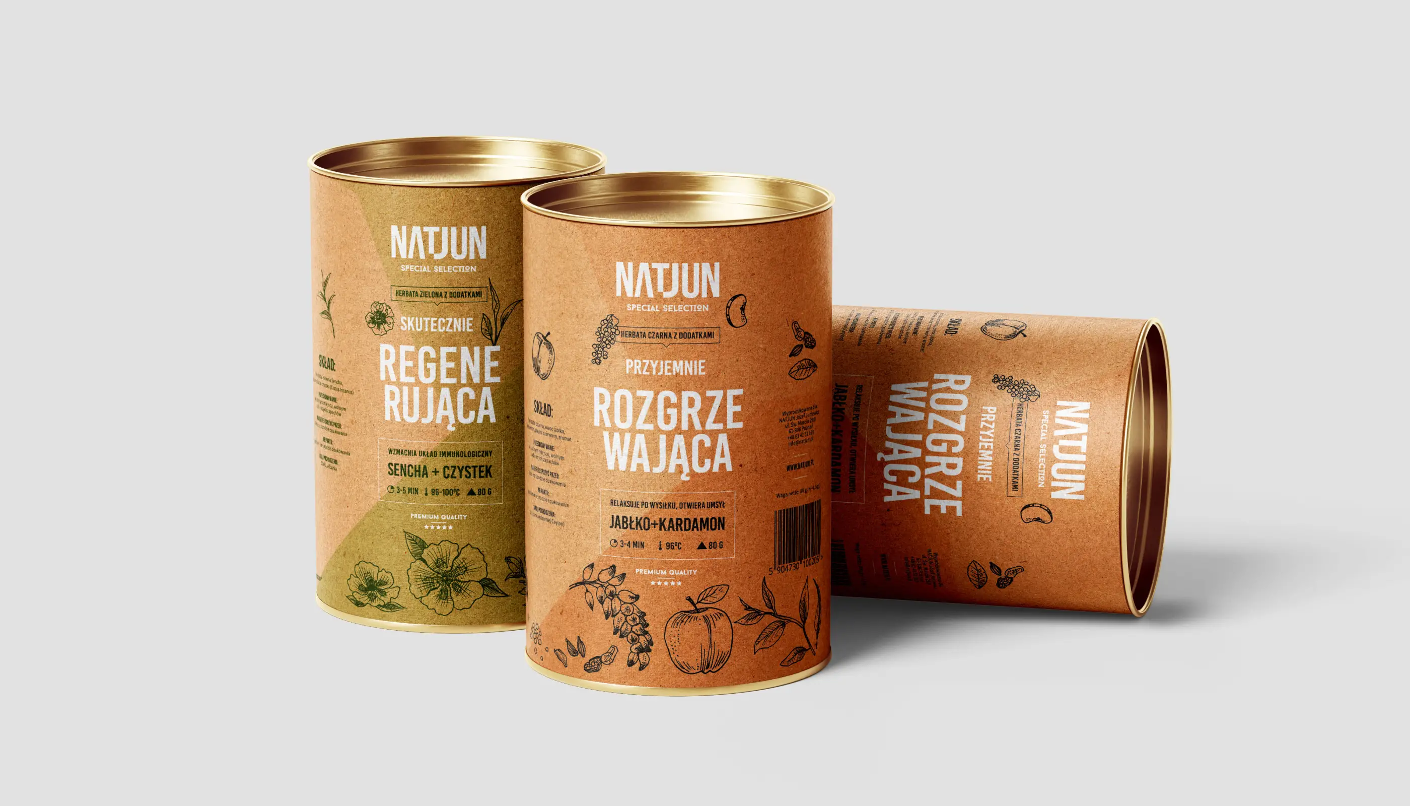
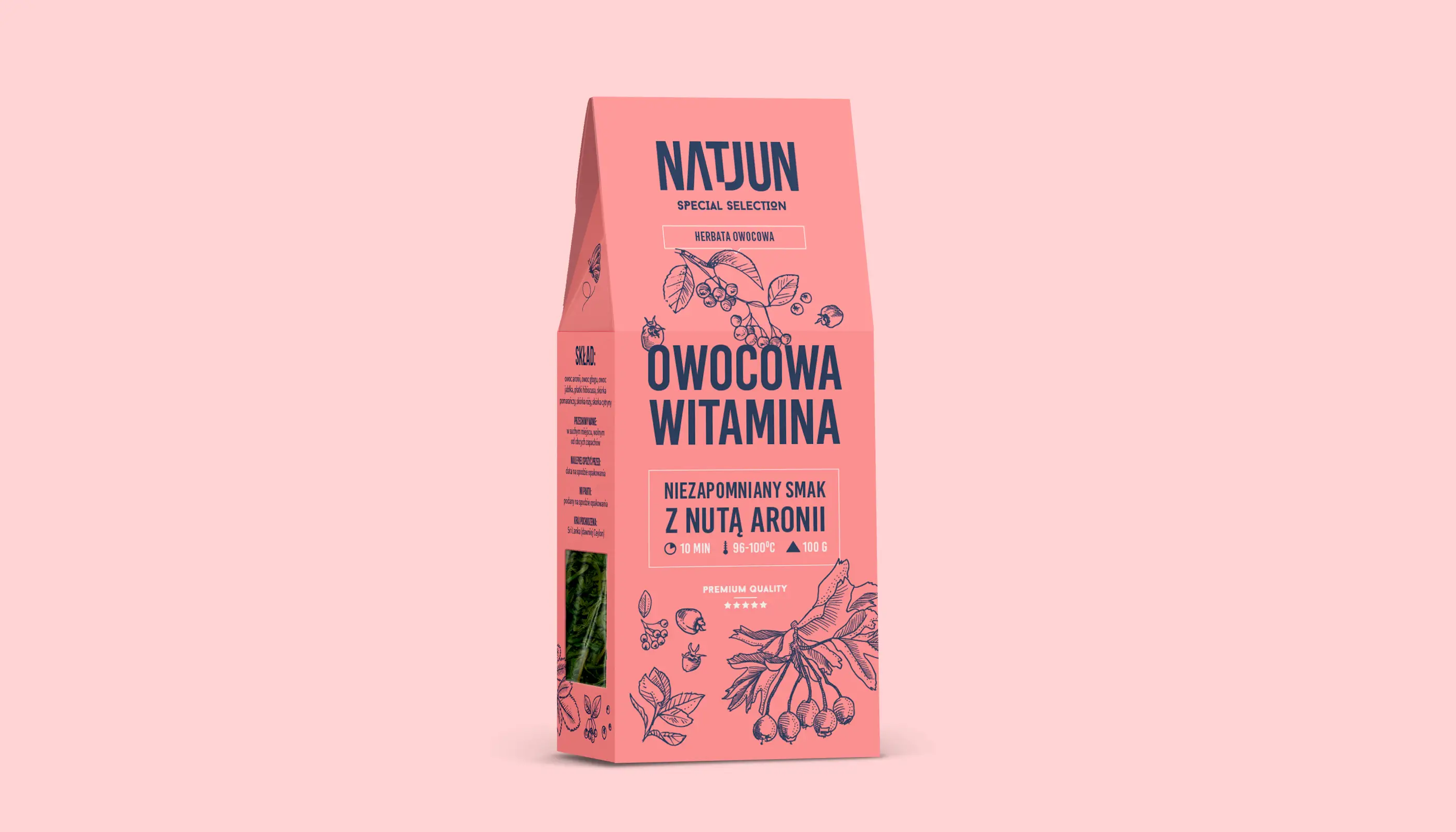
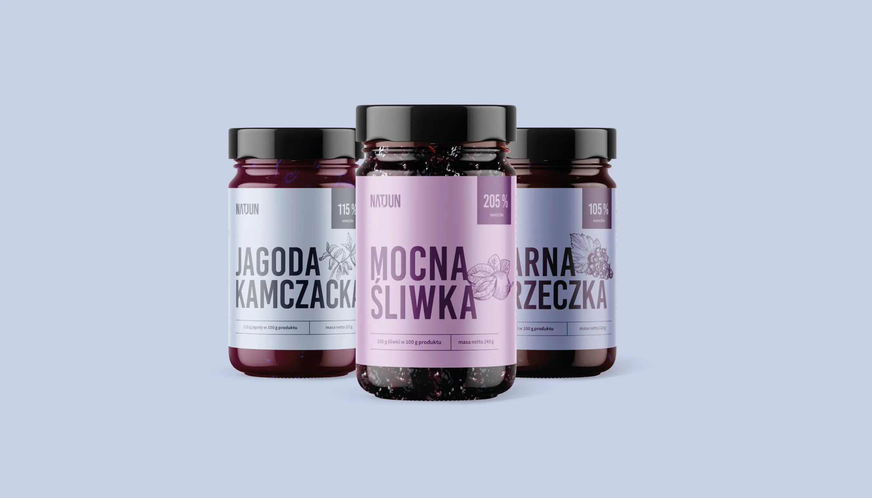
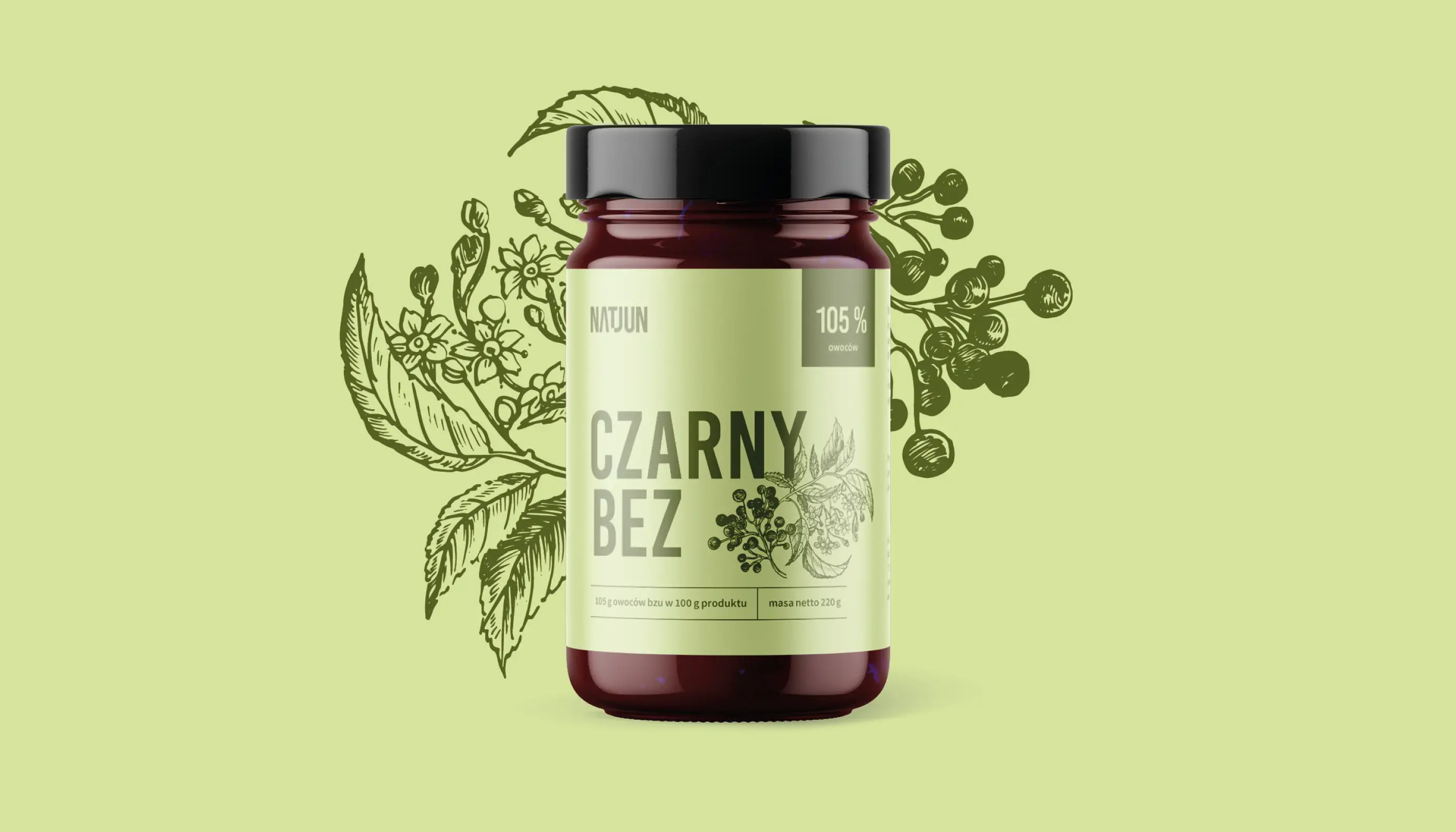
Hand-drawn illustrations
Each flavor received its own unique hand-drawn illustration to highlight Natjun's special blends. The designs were carefully crafted to ensure they aligned with the brand’s fresh, natural essence, making each product stand out while maintaining a cohesive look.
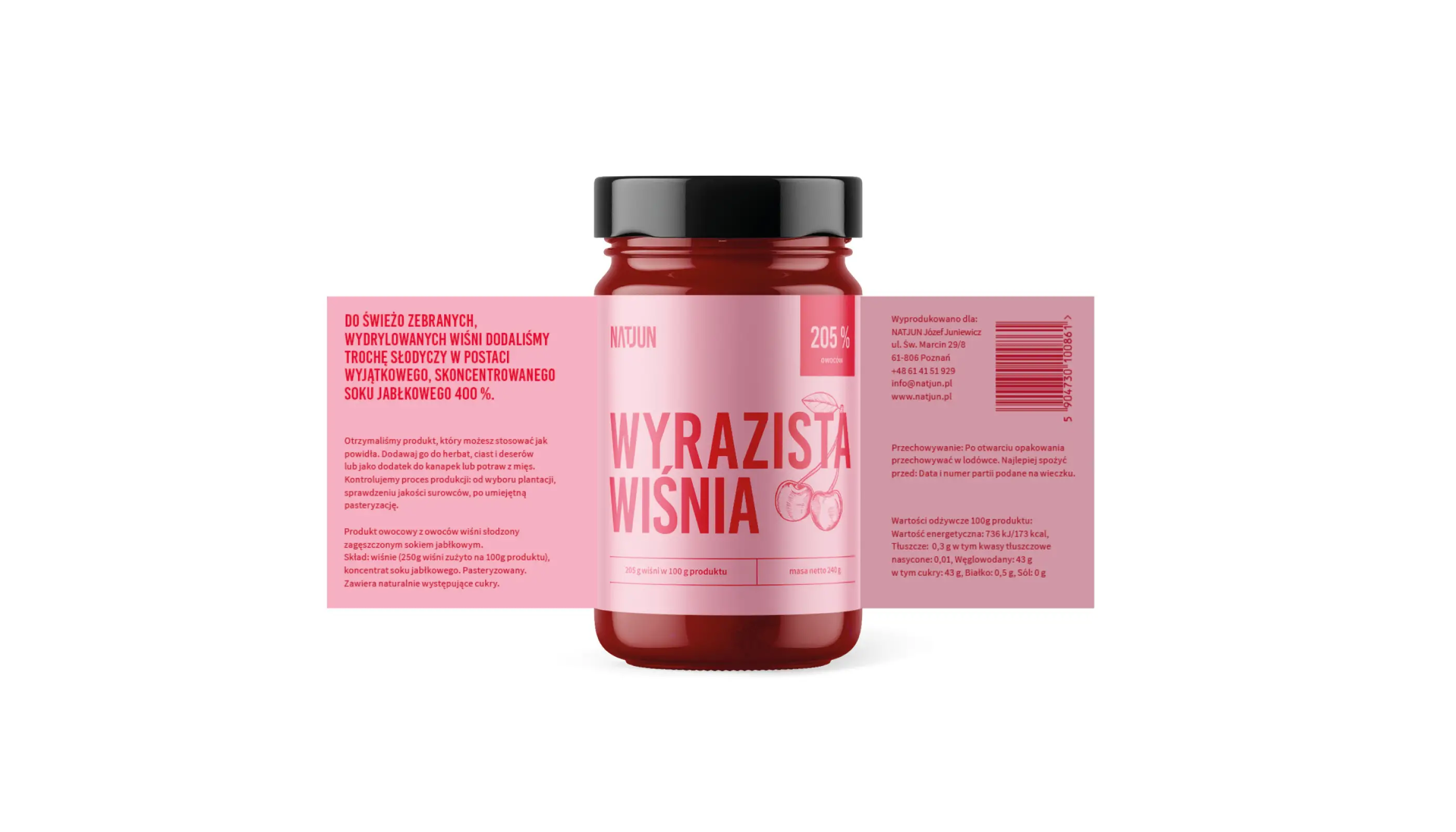
Production oversight and fine-tuning
I was responsible for overseeing the entire process, from concept development to final production. We worked with numerous subcontractors and explored various finishing techniques to find the perfect balance for the packaging. The design needed to meet the latest regulatory standards, and I made sure all the packaging followed these guidelines while maintaining the brand's visual appeal.
Illustrations: Magda Kloska, Martson