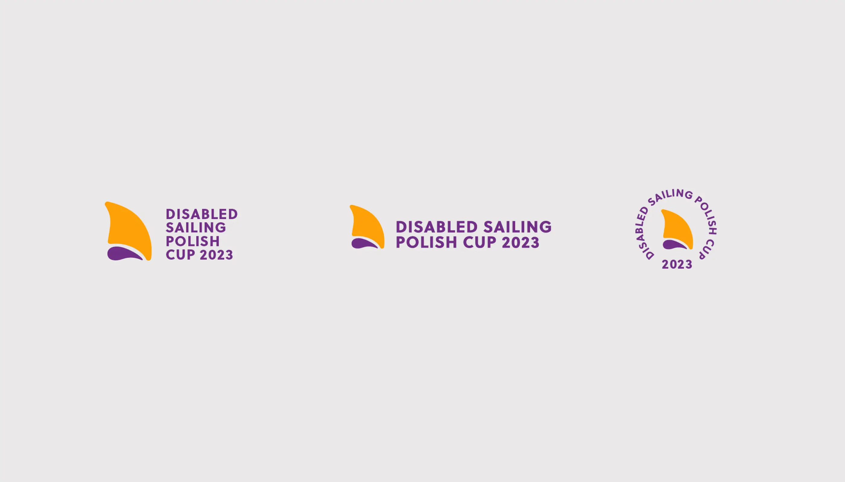
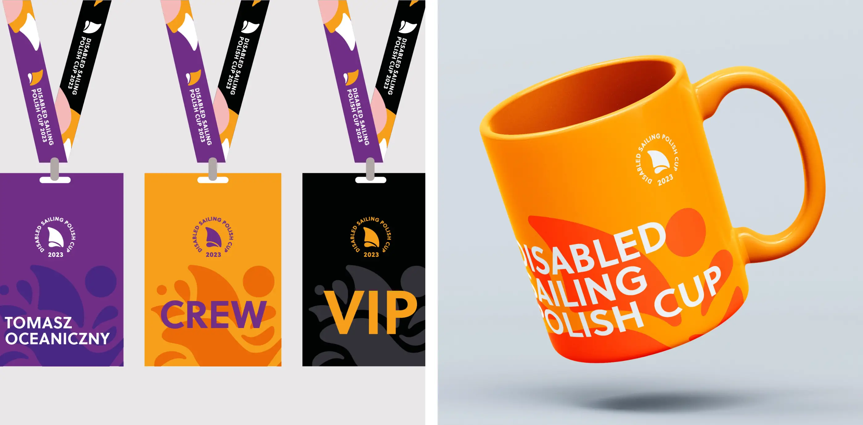
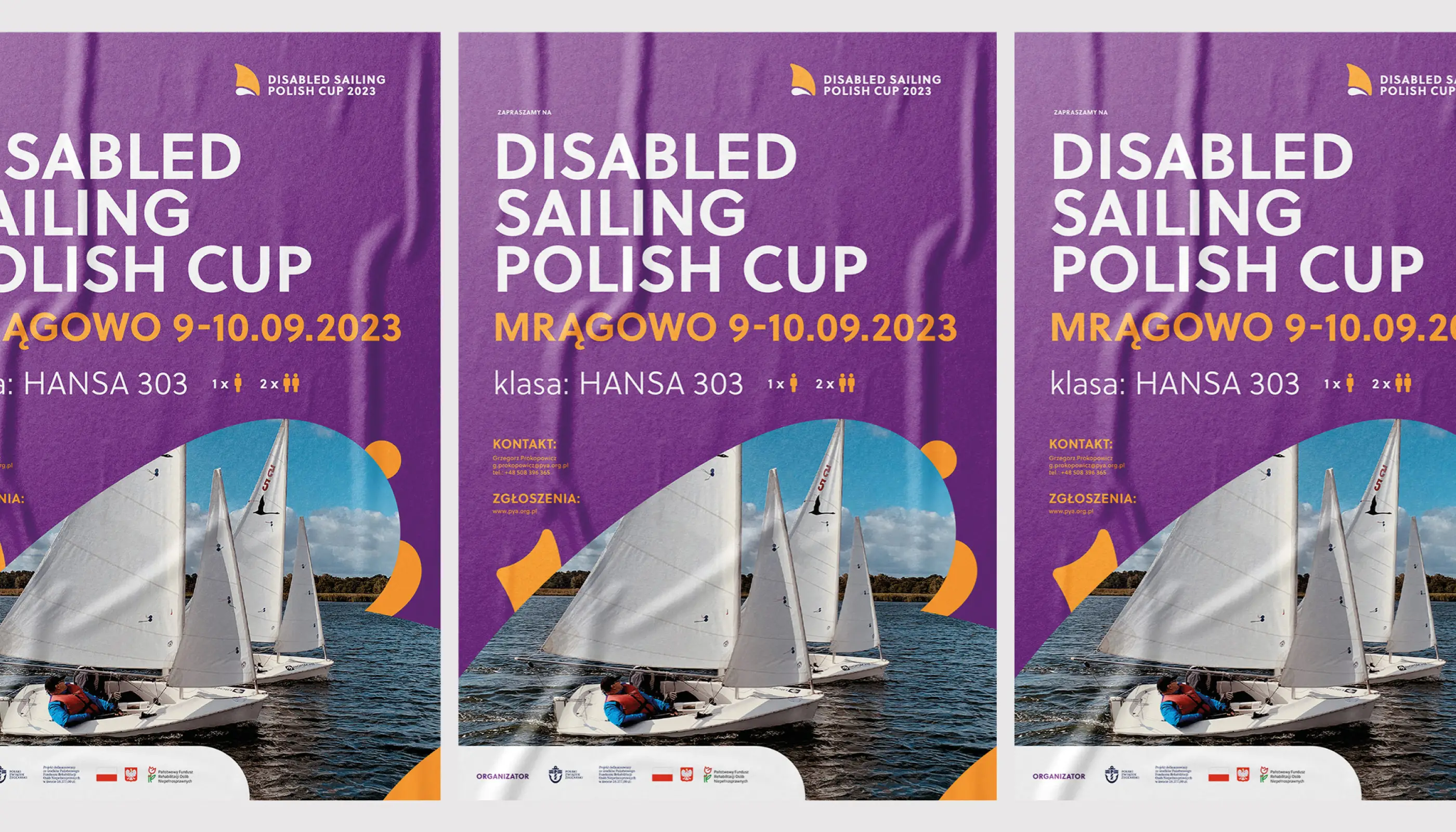
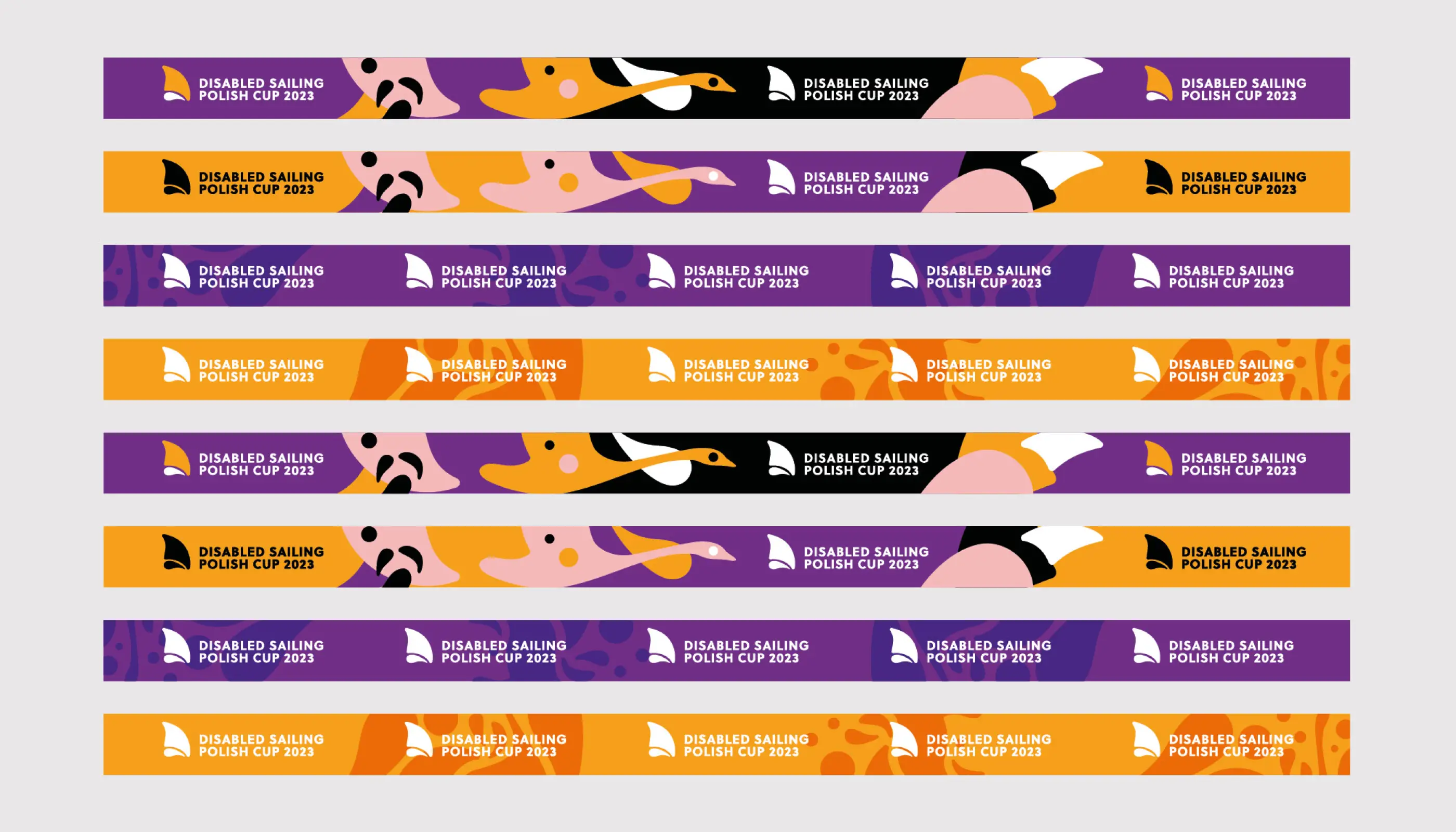
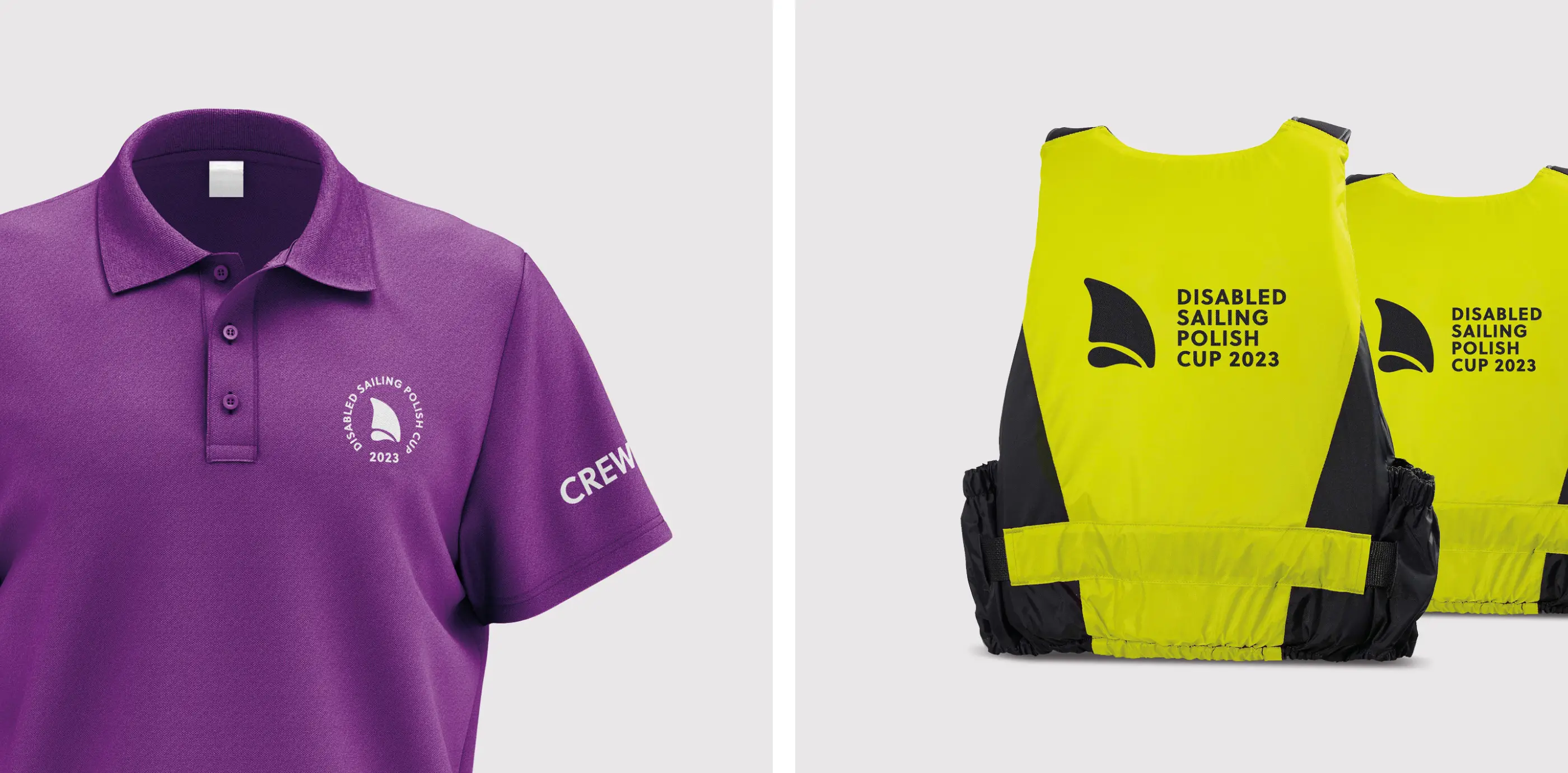
Disabled Sailing Polish Cup
Brand / Print
Sailing
2023
Disabled Sailing Polish Cup – rebranding for inclusivity
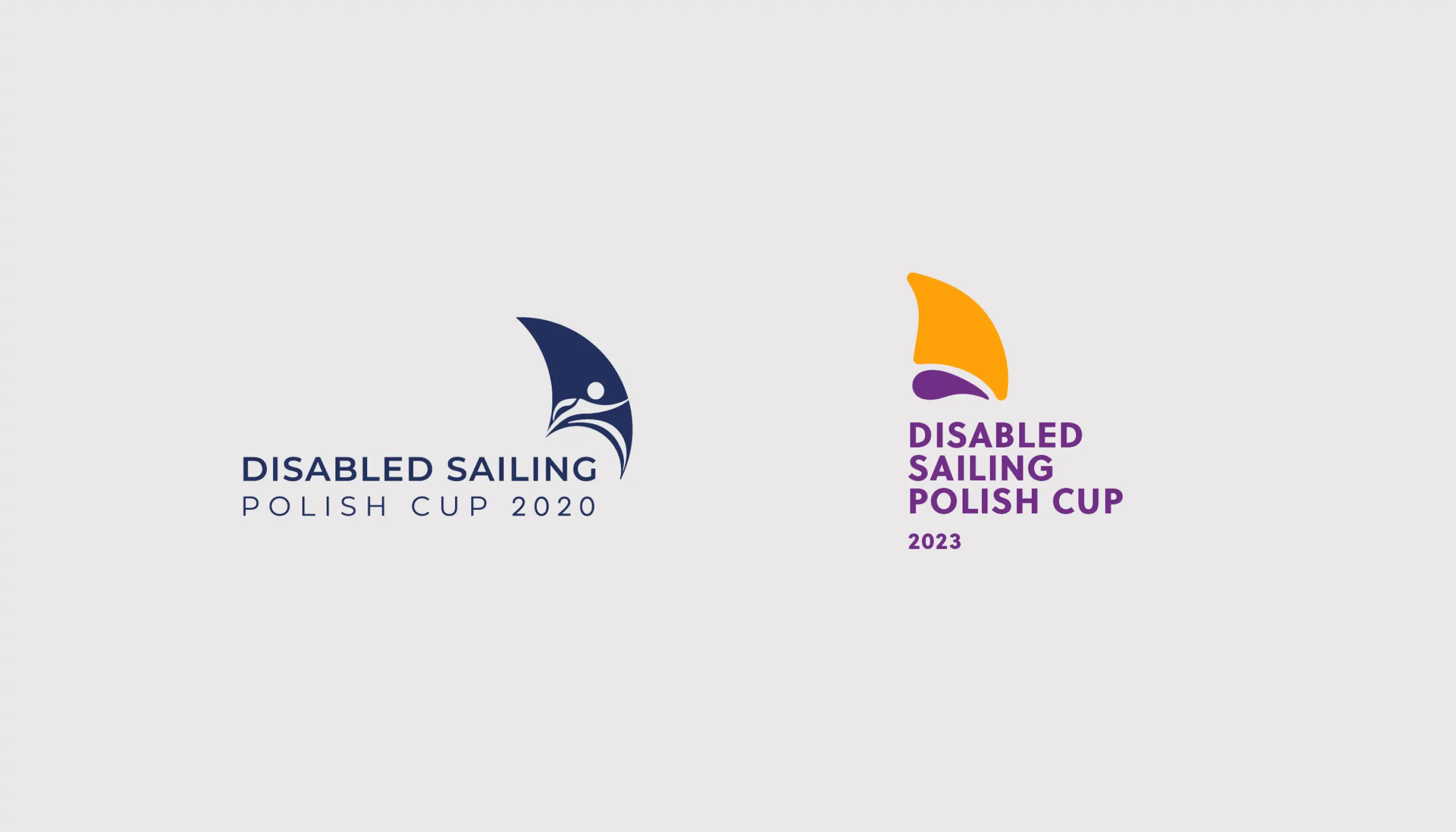
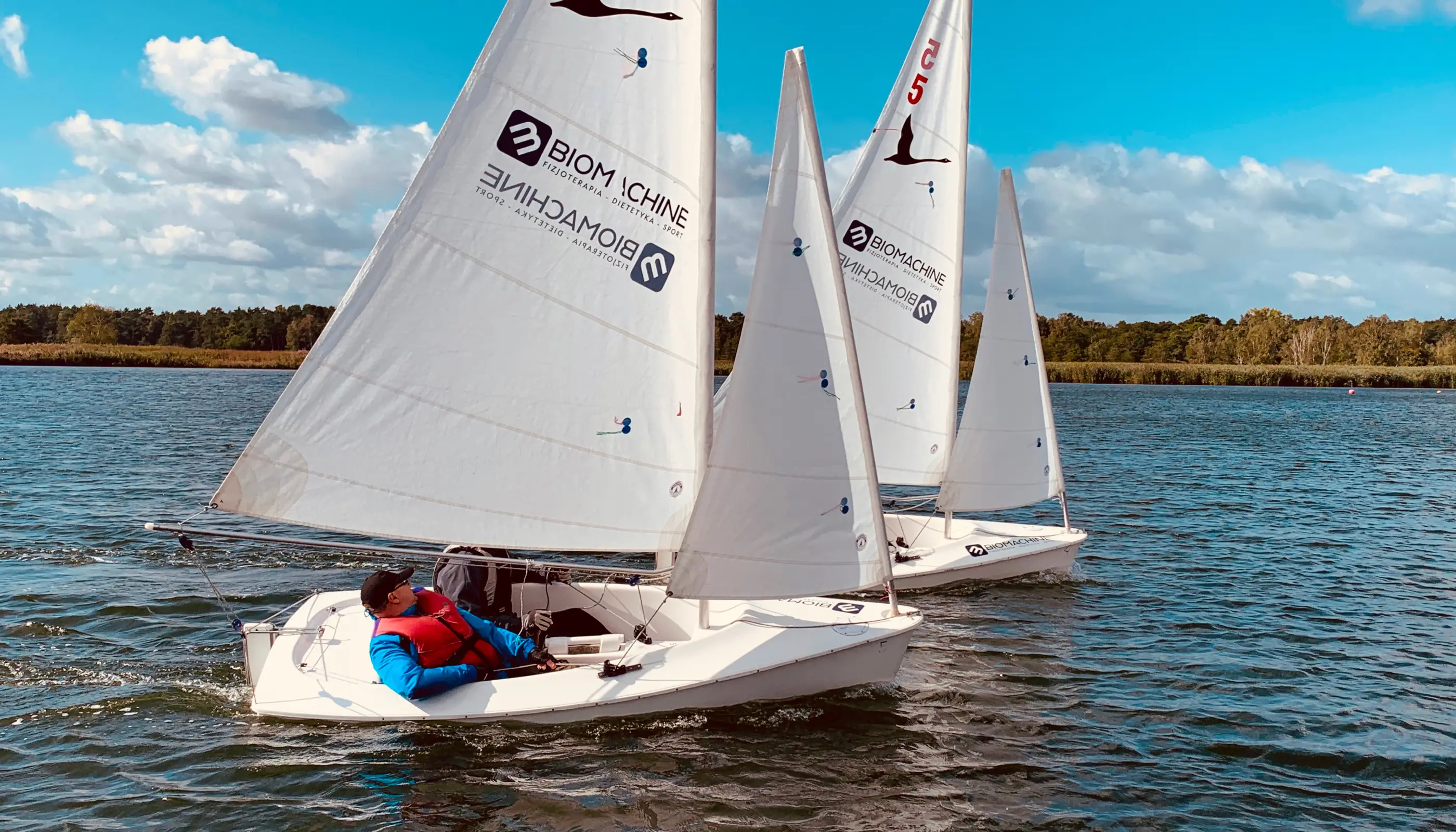
The Disabled Sailing Polish Cup is a week-long competition aimed at promoting sailing inclusivity. In 2023, 40 disabled sailors joined the regatta. The previous logo required an upgrade, as there was no cohesive graphic motif. This rebranding sought to address that gap and create a more impactful visual identity.
Challenging stereotypes
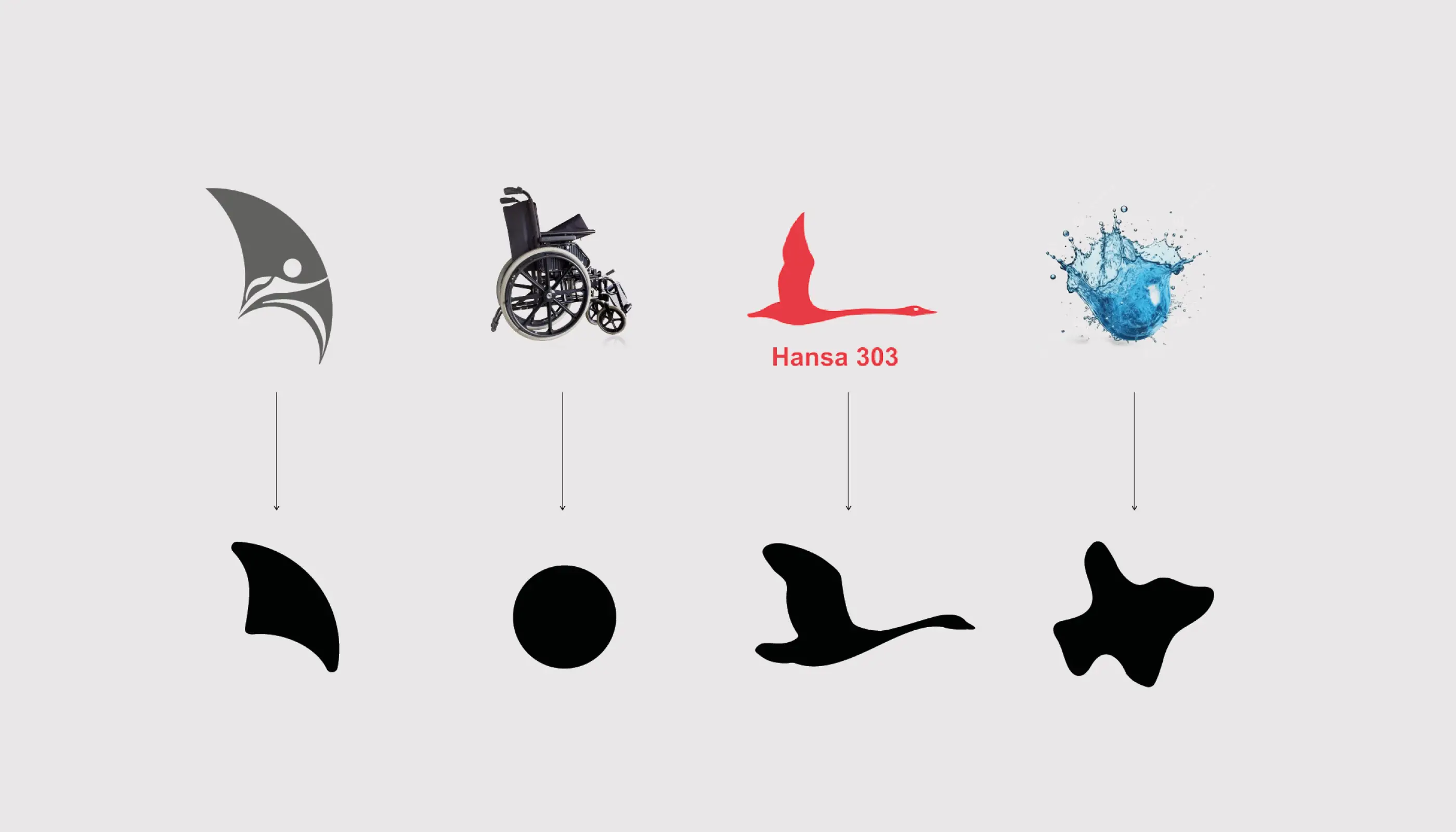
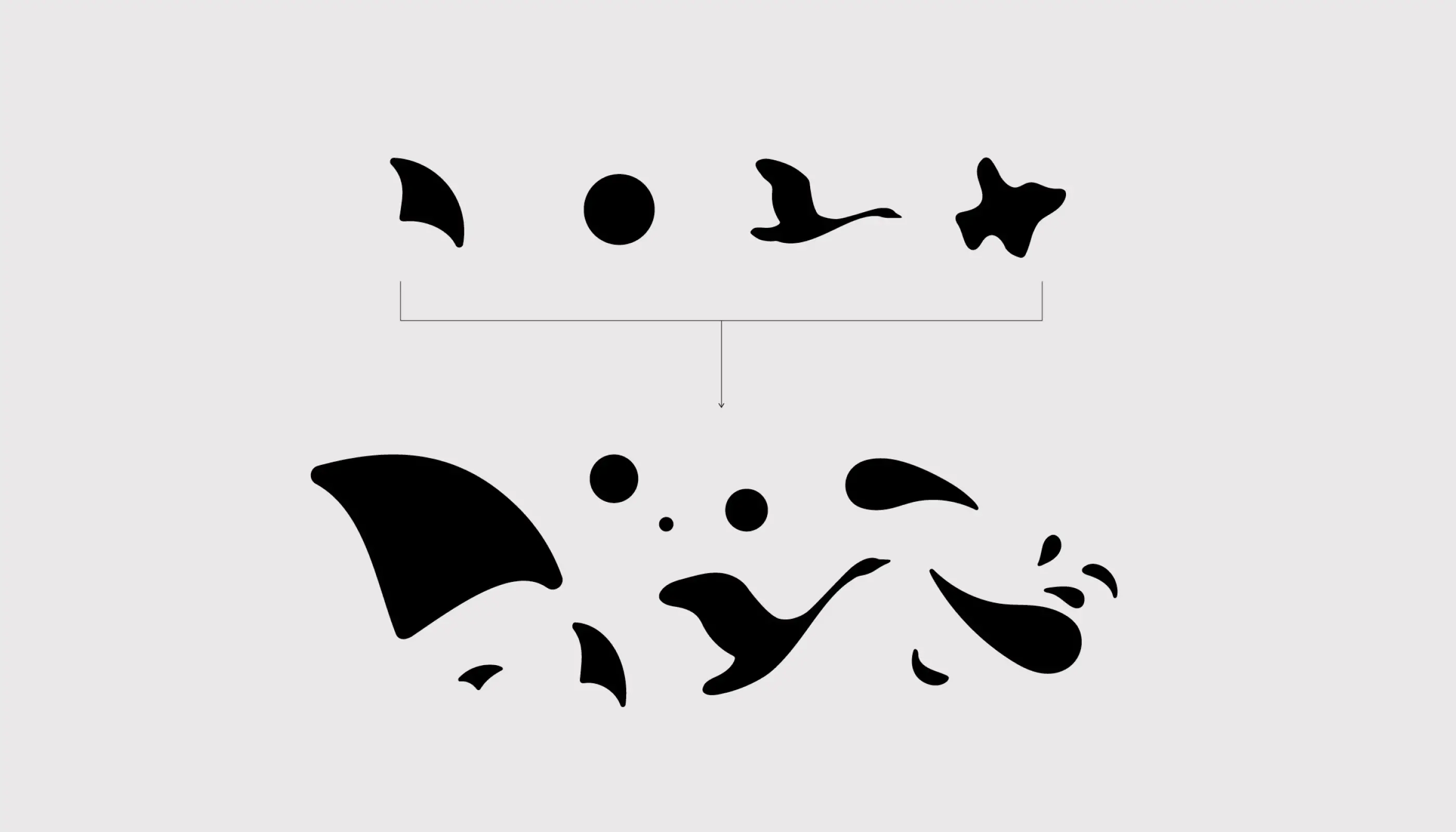
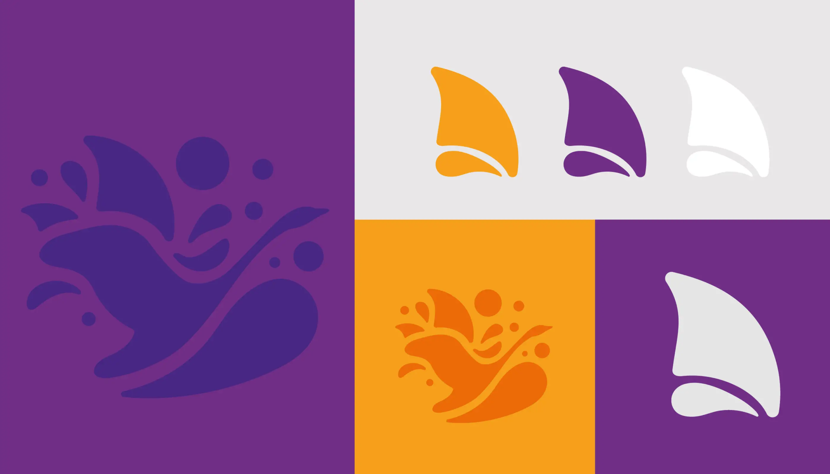
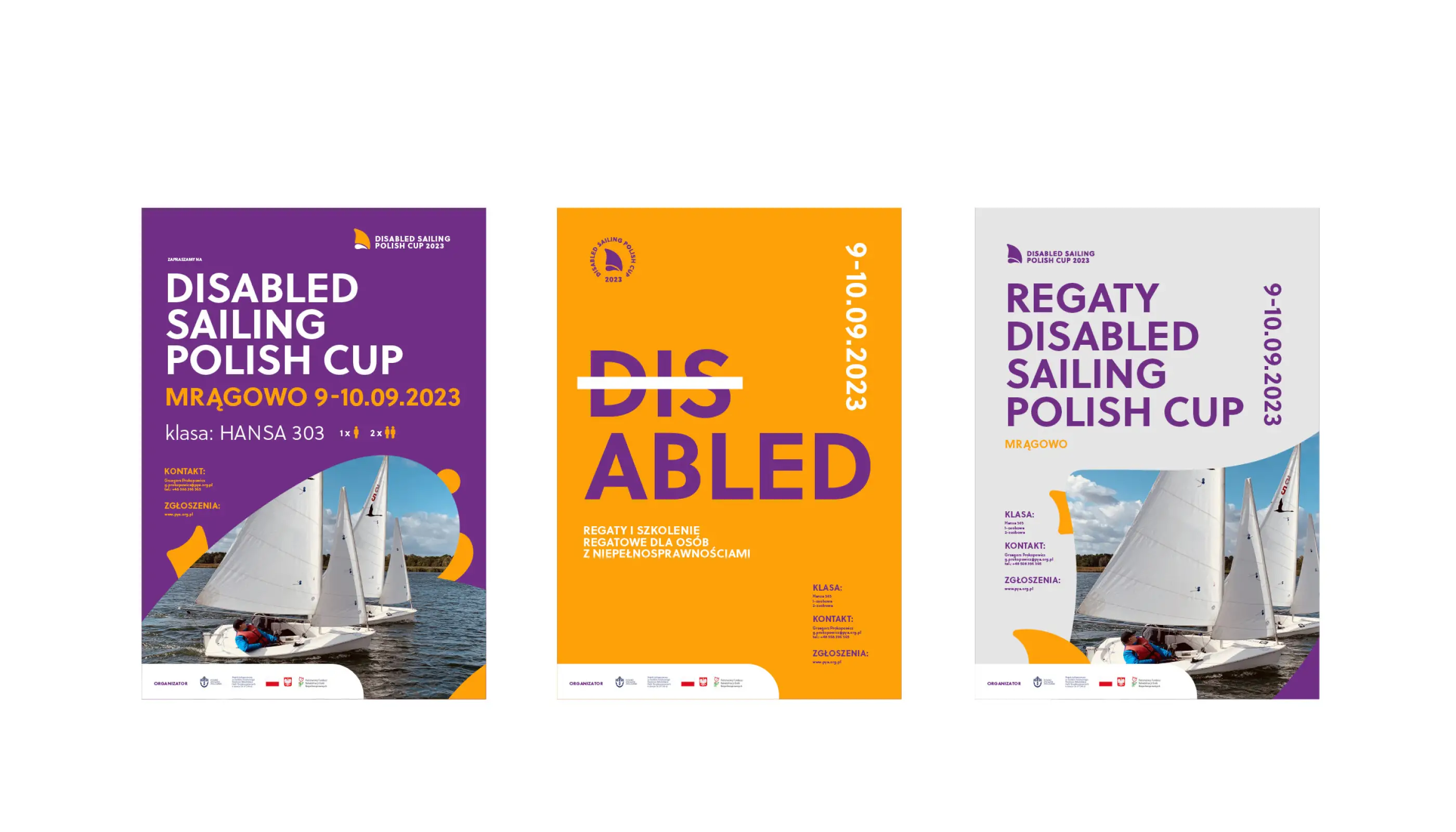
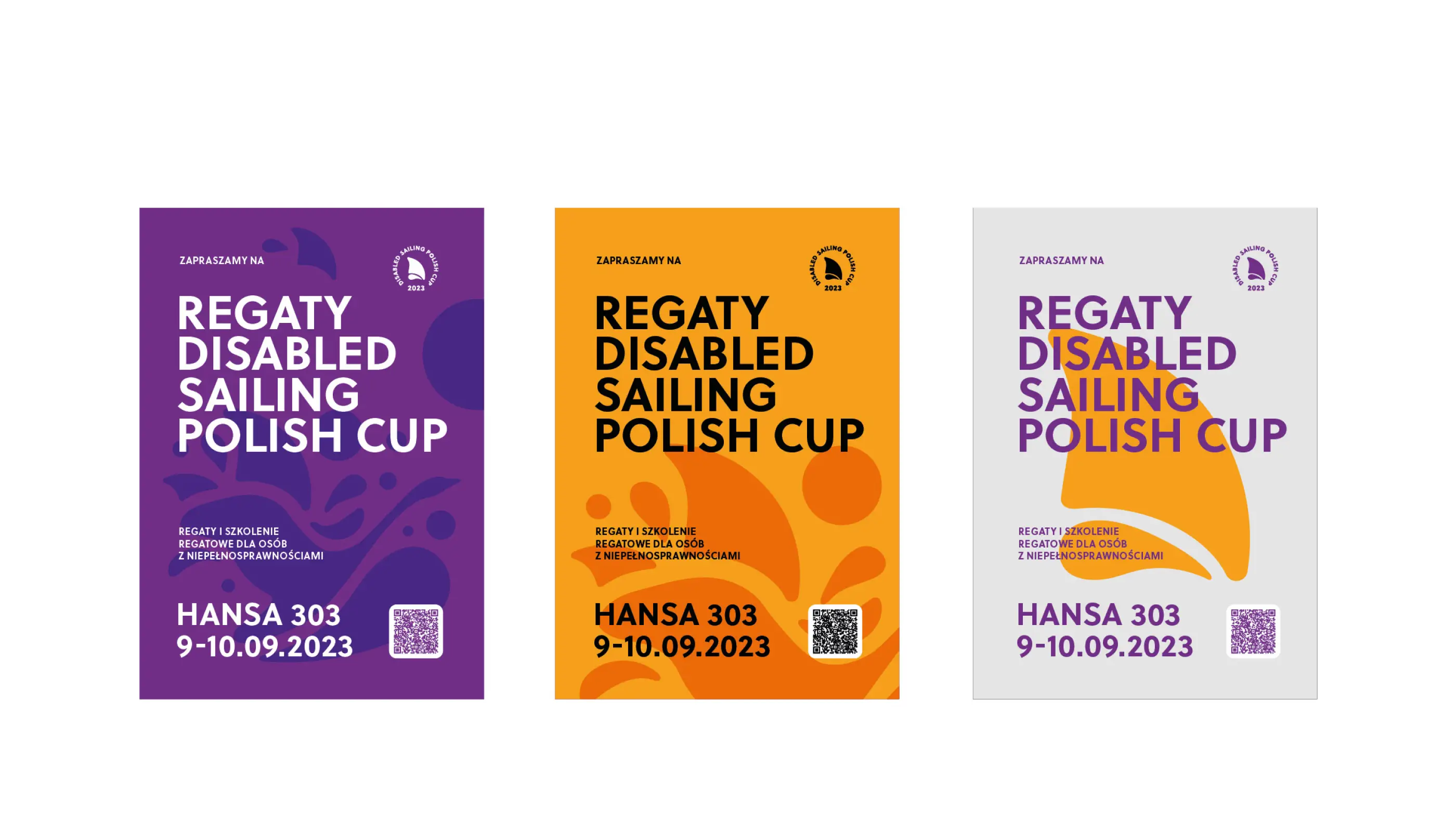
The branding challenges disability stereotypes by highlighting the courage and capabilities of the participants. One of the key design elements was using sail motifs placed above the water, not on it, symbolizing a departure from traditional sailing. These sails were then intertwined with wheels or connected, representing the shift from wheelchairs to sails. It’s a bit abstract, but it ties the concept together nicely.
A powerful first impression
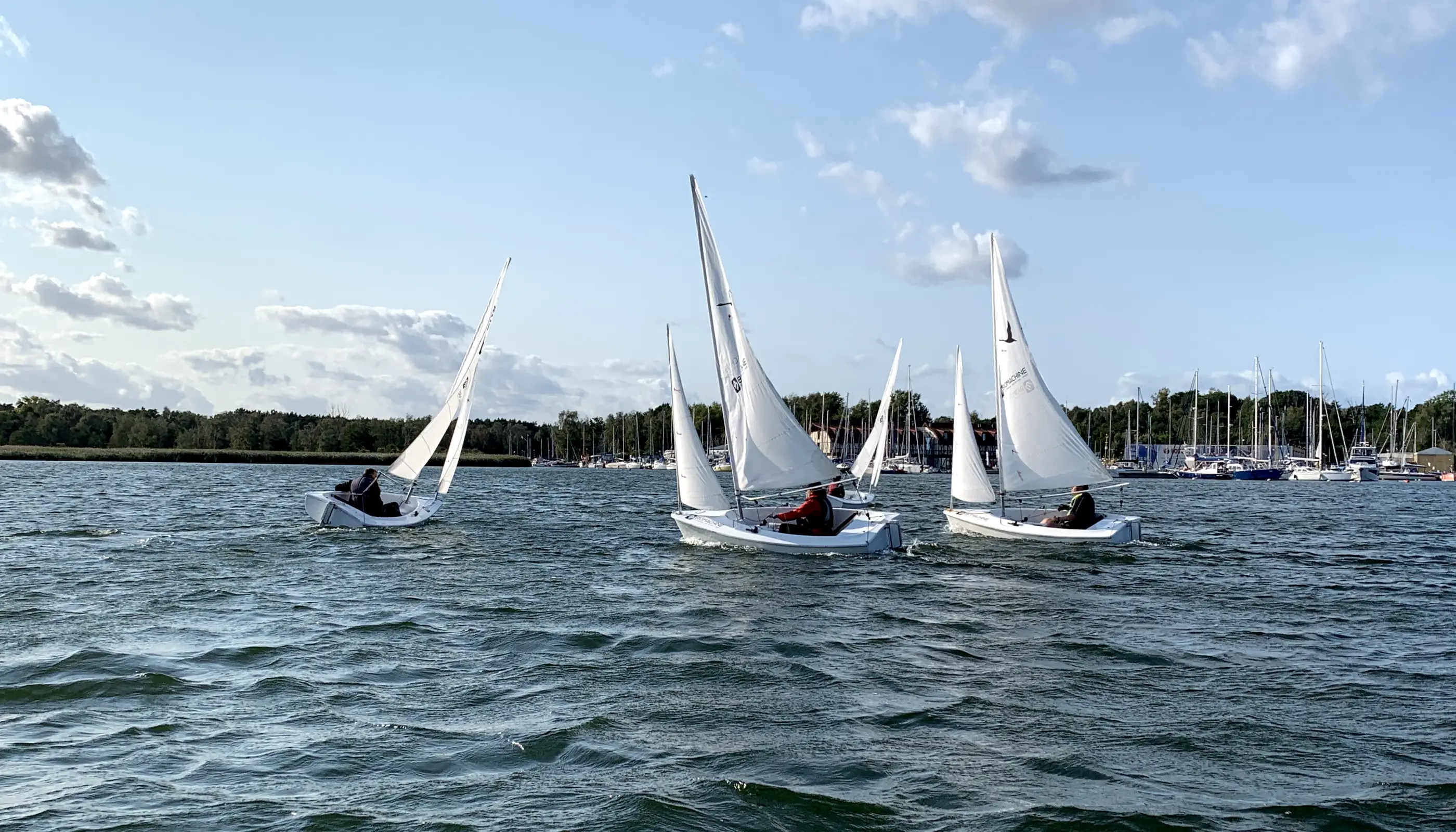
What really impressed me were the materials provided by the organizers of previous editions. Seeing how specifically the boats were prepared for the athletes left a huge impact on me. In fact, I realized that even a fully able-bodied person would struggle with some of the adjustments and intricacies required to sail these boats. This experience reinforced the idea behind the concept of crossing out "DIS" in "DISABLED" — to truly highlight the remarkable abilities of the sailors.
A design reflecting adaptability
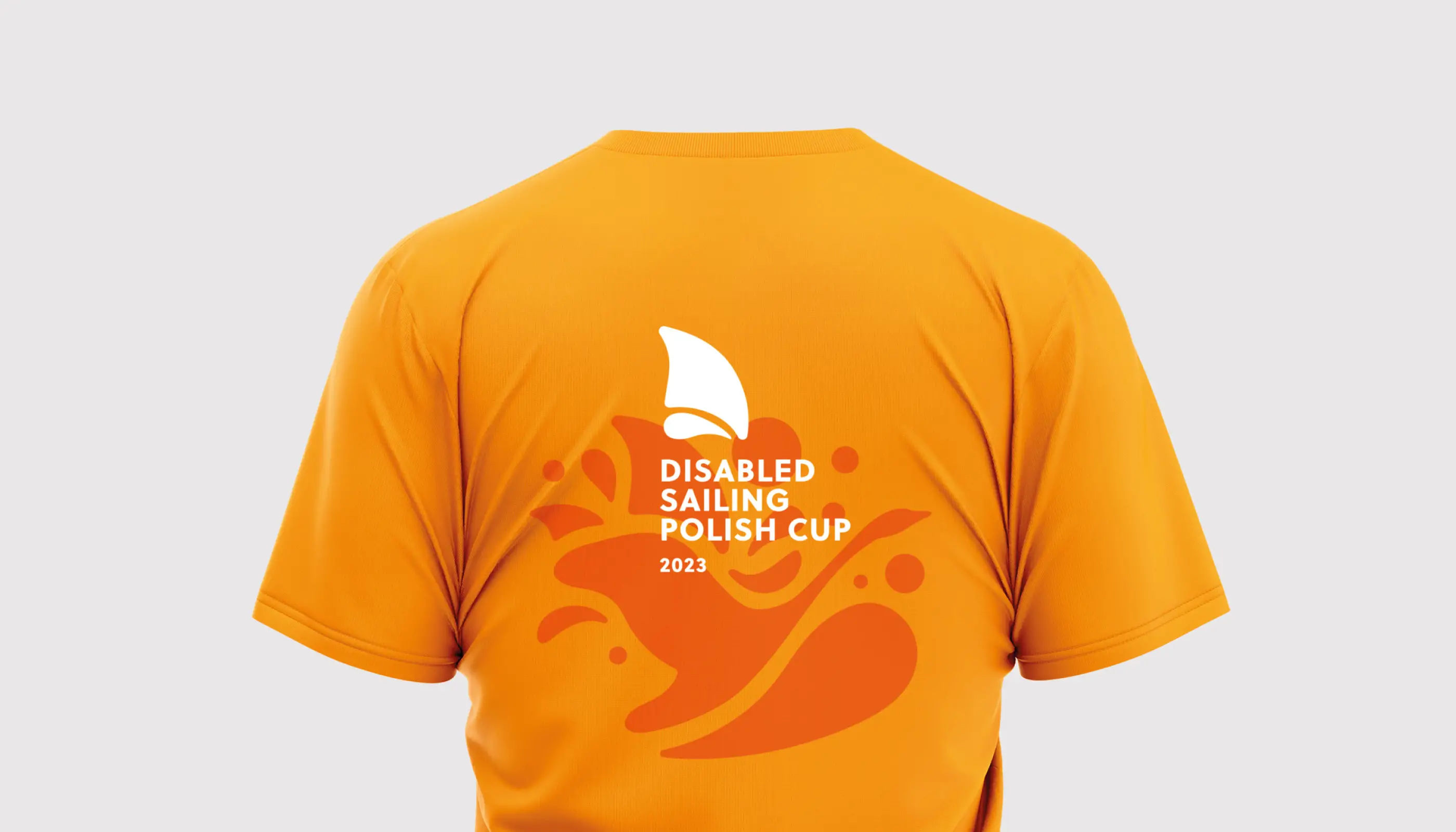
The key concept of the graphic design is adaptability, reflecting how yachts are specifically adapted for athletes. Water, with its diverse forms, is a perfect motif for this event, symbolizing flexibility and change — aligning perfectly with the adaptability theme.